Fixed
font-palette: --day;
One palette for every theme. The glyph reads the same on light and dark grounds.
- Works wherever color fonts render
- No change between themes
The November 4 preview build lets a color font sit at any point between two of its palettes, so a dark theme can tint the lettering instead of swapping it whole.
font-palette: --day;
One palette for every theme. The glyph reads the same on light and dark grounds.
font-palette: --dusk;inside a prefers-color-scheme: dark query
Two palettes, one at a time. The theme change is a hard cut from one set of colors to the other.
palette-mix(in oklch, --day, --dusk 40%);
| Feature | Fixed | Swapped | Mixed |
|---|---|---|---|
| Theming | |||
| Palettes in play | One | Two, one at a time | Two or more, blended |
| Dark theme | Same colors | Hard switch | Any point between |
| Brand control | The font's own | Two fixed looks | A percentage you choose |
| Code | |||
| Declaration | --day only | --dusk in a media query | palette-mix(in oklch, --day, --dusk 40%) |
| Palettes defined in | @font-palette-values | @font-palette-values | @font-palette-values |
| Mixing space | None | None | Any color interpolation method, such as oklch |
| Support | |||
| Safari status | Shipping | Shipping | Technology Preview 256 on Cocoa platforms |
| Fallback | Not needed | Not needed | Declare a plain palette first |
| Spec | CSS Fonts Level 4 | CSS Fonts Level 4 | CSS Fonts Level 4 |
A pricing page that sells three ways to theme a color font, with the blend as the plan you pick.
A plan compare page is the most borrowed structure on the web: cards for the decision, a table for the detail, a FAQ for the doubts. Here each plan is a CSS technique, the recommended card carries a real slider, and every section opens with the grey group row a comparison table uses to split its features.
The specimen face is Nabla, a color font on Google Fonts with several built in palettes. Everything else is set in one superfamily, Mona Sans, with contrast made by width alone: wide for display, normal for reading, condensed for labels.
#E4E3DE#1C1E21#D04E17#3E5872#F0B48A#FBFAF7Ground hatch: 1px ink lines at 6.5 percent on a 10px diagonal pitch, like the shading on a drafting plate.
WebKit's notes for Safari Technology Preview 256 list support for font palette mixing on Cocoa platforms, "allowing font color palettes to be blended." A color font stores its colors in numbered palettes; until now a page could pick one palette or define its own, and that was the whole range.
WebKit's note calls the feature font-palette-mix(). In the CSS Fonts Level 4 draft the value is written palette-mix() inside the font-palette property, and it takes an optional color interpolation method, then two or more palettes with optional percentages. That is the same shape designers already know from color-mix().
The theme switch stops being a cut and becomes a dial.
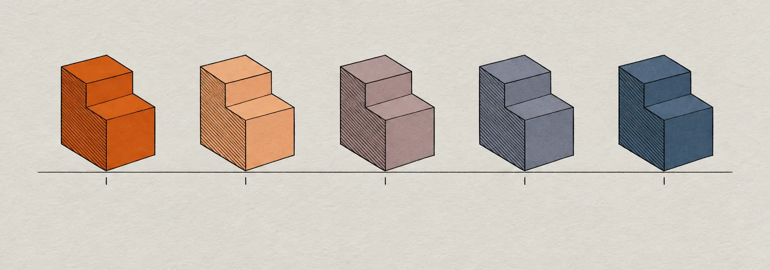
The practical gain is in themes. A display face in a brand palette can lean forty percent toward a darker palette on a dark ground instead of jumping to a second look, and the percentage can come from a custom property. The diagram below steps one form from the day palette to the dusk palette in four even moves, the way the slider above does.
The same notes add continue: collapse with line-clamp, and the line-clamp shorthand now sets it. Setting line-clamp on a card excerpt is now enough to collapse the lines after the clamp.
.excerpt {
  line-clamp: 3;
}
text-combine-upright now works on ::marker, so a list number in a vertical Japanese or Chinese layout can sit upright as one unit instead of turning on its side.
li::marker {
  text-combine-upright: all;
}
object-fit, object-position and object-view-box now apply to SVG documents loaded through embed and object. An illustration file can be framed and cropped the way an img already can.
embed.plate {
  object-fit: cover;
  object-view-box: inset(10% 0);
}
Lovable's November 15 changelog entry reworks the comments left on a project's live preview, which is where client review of an AI built page now happens.
A movable pin fixes the usual drift: a note keeps pointing at the element it was about after the agent moves things around. It follows the image editing Lovable brought into its chat last week.
Only behind a fallback. Declare a plain palette first and the mix second; a browser that cannot read the mix keeps the first declaration. This page does exactly that on the issue number and the Mixed card.
Any color font that ships more than one palette. Nabla, used on this page, carries several; check the font's specimen or its palette list before you design around a number.
Install Safari Technology Preview on a Mac and open a page that defines two palettes with @font-palette-values. Drag the slider above to see the in between states.
On a plan compare page, give the recommended card the one working control and let it drive the rest of the page through a single custom property. Here the slider sets one percentage, and the card's specimen and the masthead number both follow it.
@font-palette-values --day {
  font-family: Nabla; base-palette: 0;
}
@font-palette-values --dusk {
  font-family: Nabla; base-palette: 6;
}
.plan-pick .spec {
  font-palette: --dusk; /* fallback */
  font-palette: palette-mix(in oklch,
    --day, --dusk var(--mixp, 40%));
}
/* the slider writes one value */
mix.oninput = () => root.style
  .setProperty('--mixp', mix.value + '%');
Paste into Claude Code, Framer, Beaver Builder AI, Lovable, v0 or Figma Make.
Build a single-page plan compare landing page for a product with three tiers. Treat it as a real pricing page a freelancer would ship, not a poster.

Structure, top to bottom:
1. Slim top bar: wordmark left, three text links right.
2. Hero in two columns: left holds a solid ink kicker label, a wide heavy headline (max 16 characters per line), a two-sentence deck, an orange primary button and a plain text link. Right holds a "buy box" card (1px ink border, 14px radius, hard 6px offset ink shadow): a product image on top with four small mono callout labels pinned to its right edge, then the masthead details as a short label/value list.
3. Three plan cards in a row. The recommended card gets a 2px ink border, an orange offset shadow, a solid orange badge, and the only live control on the page: a native range input that writes one CSS custom property. Each card: name, a large specimen, a mono "price" line, two sentences, a check list with real ticks and a dash for missing items.
4. A full compare table on a white card: columns per plan, the recommended column tinted pale apricot with an ink header cell; rows split by grey feature group header rows (uppercase condensed labels).
5. Every later section opens with the same feature group row used full width: a mono group number, a wide heavy h2, a solid label on the right.
6. Content sections: a two-column art direction card, a 680px reading column beside a facts list, a three-up technique row with small code blocks, a FAQ built from native details/summary, a slate design move panel of prose beside a dark code block, a dark prompt card with a copy button, then a field note beside a sources list under a 2px ink rule.

Palette: stone ground #E4E3DE with a 1px diagonal ink hatch at 6 percent on a 10px pitch; ink #1C1E21; cards #FBFAF7; burnt orange #D04E17 for marks and #BF4510 for buttons; slate #3E5872; apricot #F0B48A.
Type: one superfamily with a width axis (Mona Sans): 125 percent width for display, 100 for body, 75 for uppercase labels. JetBrains Mono for code only.

Guardrails: body text at least 19px with 1.65 line height and lines near 70 characters; WCAG AA contrast on every label against its real surface; radius 12-14px on cards, 6-8px on controls, no pill shapes; one offset shadow per card at most; hover and focus states at 150ms easing with a prefers-reduced-motion guard; no gradients, no glow, no neon, no fake readable text in images, no logo bars, no fake toggles.
Color fonts have mostly stayed in hero lettering, where one palette was enough. A dial between palettes is a reason to set one where a dark theme can reach it.