
Today's art direction
The Portal Letter
A creator newsletter page, printed in four flat inks on deep indigo.
The page sells a daily letter, so it is built like a writer's signup page: a wide nameplate, one hero plate, a subscribe card that overlaps it, and a shelf of contents. Contour lines sit faintly behind the hero, a map of depth for a story about depth. Every section opens on a copper spine label resting on a shelf rule, and the contents are books on that shelf, tall for long sections and short for quick ones.
Palette
- Indigo ink ground
#11182A - Sand cream
#EDE6DA - Copper
#C97B4A - Pale tan
#E3B58E - Steel blue
#8FA3B8
Type
Unbounded, a wide geometric display face, carries the nameplate and headings; Brygada 1918, a sturdy text serif, carries the letter. Spline Sans Mono labels the shelves.
What WebKit shipped on Monday
WebKit published a developer preview of Spatial CSS on November 16, written by Brandel Zachernuk. It runs in Safari on visionOS 27.3, behind a feature flag, and it is built around the model element for 3D objects. The post describes the whole thing as a set of small tweaks to syntax designers already use.
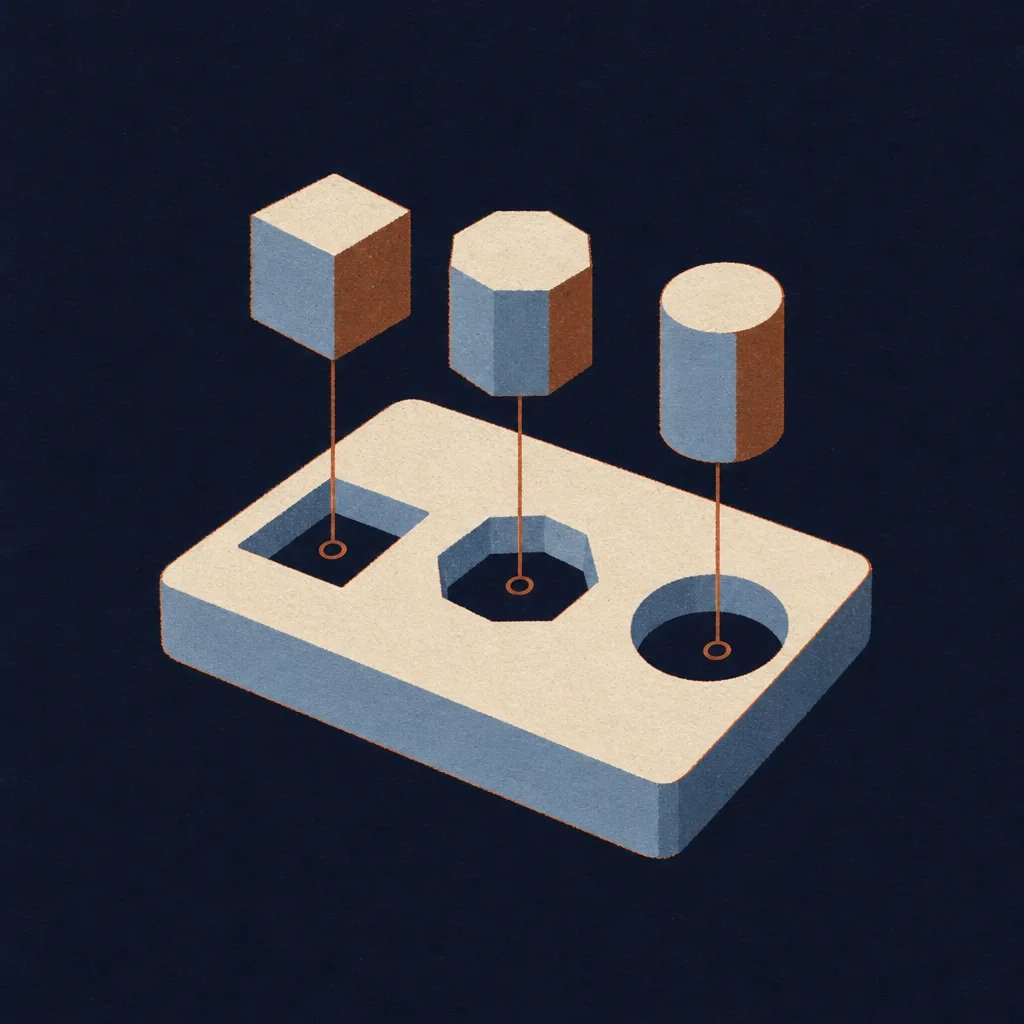
The central idea is the portal. Mark an element with spatial: portal and its children share one 3D space that sits behind the page, like a room seen through a window. Inside that room, transforms work in true depth, measured in real units, so a model can sit fifty centimetres to the left of another.
“Spatial web standards should support designing for browsers wherever they run.”Brandel Zachernuk, WebKit blog
The proposal lives in an editor's draft called CSS Spatial Level 1. WebKit calls the preview limited and says the proposed spec has a long road ahead, and it asks developers for feedback while the shape is still soft.
- spatial: portal
- Turns an element into a portal whose children share one 3D space.
- transform, in depth
- Moves, rotates and scales models inside the portal as real 3D transforms, built on DOMMatrix.
- position-anchor and position-context: anchor
- Aligns and orients one model to a named anchor on another, so the pieces of a scene can snap together.
- @environment-map
- Defines a named lighting environment from a 360 degree HDR image that any element can reuse.
- portal-action: orbit
- Lets the viewer orbit the scene; the post mentions pan modes as possible later additions.
- requestVolumetricScene()
- A script method, called from a user action, that moves the scene out of the window into the room while staying linked to the page.
Anchor positioning, now for objects
The part worth studying now is how little is new. The preview reuses the anchor positioning designers learned for tooltips and popovers: name an anchor on one model, point another model at it, and switch the positioning context to anchor so the second model takes the first one's position and orientation. WebKit's puzzle playground demo uses it to seat shape blocks in a board.
/* pattern from the WebKit post, simplified */
.scene  { spatial: portal; portal-action: orbit; }
.board  { anchor-name: --board; }
.block  { position-anchor: --board;
          position-context: anchor; }

@environment-map spooky {
  format: equirectangular;
  src: url(room.hdr);
}
.scene  { environment-map: "spooky"; }
Lighting follows the same habit. An environment map is declared once as an at-rule and referenced by name, the way a font or a palette already is, so a scene's light becomes a design token rather than a per-object setting.
Also on the bench this week
-
Penpot 2.19.0, November 9
Penpot strokes each side of a box separately
Penpot 2.19 adds individual stroke widths for the top, right, bottom and left of a shape, and lets design tokens drive each of those sides. Keyboard shortcuts are now configurable, and token libraries can sync across files.
It follows the renderer work that let Penpot outline a stroke in September. Self-hosted teams should read the migration note before upgrading.
-
Lovable, November 10 and 11
Lovable edits images inside the chat
The image toolbar from Lovable's Files view now opens on images posted in Chats, and in Files it can resize an image or animate it as a brief clip, per the Lovable changelog.
It lands a day after Lovable pinned preview comments to elements, and it removes one round trip to an image editor for crops and quick resizes.
Try the preview without a headset
Install the visionOS simulator through Xcode. WebKit's post confirms the preview runs there as well as on Vision Pro.
Turn on the flag. In Settings, open Apps, then Safari, then Advanced, then Feature Flags, and enable CSS Portals.
Open the puzzle playground and read its stylesheet. It is the shortest complete example of a portal, anchors and an environment map working together.
Ask your build tool to annotate, not ship. Have it mark which parts of a product page would become a portal, so the flat page stays the source of truth.
Borrow this pattern: the flat page first, depth as a layer
Build the page so it is complete in two dimensions, then add the spatial version inside a feature query. Browsers that understand portals get the room; every other browser gets the same product shot in a frame, with no second page to maintain.
- Give the 3D object a flat stand-in that already does the job: a photo, a poster frame, an illustration.
- Put every spatial property inside one feature query, and nothing else.
- Keep the copy, buttons and price outside the portal so they never depend on it.
/* flat by default */
.product-shot { aspect-ratio: 3 / 2; }

@supports (spatial: portal) {
  .product-shot { spatial: portal;
                  portal-action: orbit; }
  .product-shot img { display: none; }
}
Prompt Lab: the reader's copy
Runs as written in Claude Code, Figma Make, Beaver Builder AI, Lovable, Framer and v0.
Build a single-page landing page for a creator's daily newsletter. It is a real signup page a freelancer would ship for a writer, not a poster.

1. Ground and palette: a deep indigo ink ground (#11182A) with sand cream text (#EDE6DA). Copper (#C97B4A) is the one loud accent for labels and spine blocks; pale tan (#E3B58E) is the quieter tone for italic text and links; steel blue (#8FA3B8) for secondary labels. Behind the hero only, draw faint topographic contour lines as one SVG at about 7 percent opacity. No gradients, no glow, no neon.

2. Type: Unbounded (wide geometric display, weights 500 to 800) for the nameplate and headings; Brygada 1918 for body text at 19 to 20px with line height 1.7 and lines of 60 to 75 characters; Spline Sans Mono for small labels only.

3. Nameplate: a full-width flag between a 3px cream rule and a 1px cream rule. A very large "No. 185" on the left in Unbounded with the number in copper, and one short sentence on the right naming the newsletter, the send date and the reading time. Not a grid of boxed metadata cells.

4. Hero: centred kicker label, a balanced headline under 20 characters per line, and a two-sentence deck. Below it a wide 3:2 illustration that shares the page ground so it has no visible border. A cream subscribe card overlaps the illustration's lower right corner: a heading, one sentence, a dark full-width button that links to the real RSS feed, and two small text links. This card is the only element with a shadow, a hard offset shadow with no blur.

5. Contents shelf: the table of contents as a row of book spines standing on a 6px cream shelf. Each book is a real anchor link with the section title, its number and its reading time, and its height is set from its reading time. On hover a book lifts 8px. On mobile the books become a stacked list of horizontal bars.

6. Sections: each opens with a shelf label, a small copper block holding the section number, sitting on a full-width hairline rule beside a mono uppercase label. Use cream cards for the art direction summary and the design move, a 680px reading column for the main story with one italic pullquote under a 2px copper rule, and a definition list of what is new with the term in mono on the left.

7. Close: an archive shelf of three earlier issues as linked cards, then the field note beside a numbered sources list, then previous, index and next links.

8. Images: flat four-ink screenprint illustrations in the page palette with slight misregistration and paper tooth. No readable text, letters or logos inside the images.

Guardrails: WCAG AA contrast for every label against its real background, hover and focus states with 150ms easing on links, books and buttons, a prefers-reduced-motion guard, no fake form fields, no pill-shaped everything, no emoji, no gradient text.
Earlier letters on the same shelf
Issue 181
Figma rotates layers on three axes and hands over the CSS
The flat-screen version of today's depth story.
Issue 184
Safari mixes two palettes of one color typeface
Yesterday's WebKit preview, a quieter CSS change.
Issue 126
Penpot converts strokes to paths on its WebGL renderer
The renderer behind this week's per-side strokes.
Field note
The useful part of this preview is the vocabulary. A portal, an anchor and a named light are all ideas a designer can sketch in a flat file today.
Sources
- Introducing Spatial CSS: a developer preview, WebKit blog
- CSS Spatial Module Level 1, editor's draft
- Webkids puzzle playground, WebKit demo
- Penpot 2.19.0 release notes, GitHub
- Lovable changelog, Lovable docs